The World's Greatest Compromise
- Youtube Views 2,784,903 VIDEO VIEWS
Video hosted by Fred Mills.
30 April 2021: This article was amended to clarify that the June 2005 redesign of One World Trade Center came from David Childs and Skidmore Owings and Merrill only.
GROUND zero is one of the most challenging construction sites there’s ever been.
In the wake of 9/11 everyone agreed that something had to be done but no one could agree on exactly what.
The resulting skyscraper that now stands alongside the memorial on the site is an almost reluctant American icon. It’s a building that does a bit of everything that everyone wanted - whether that was projecting strength or appearing elegant, acting as a symbolic landmark or offering premium office space.
It’s a skyscraper built of compromise, an icon by committee.
Many felt that rebuilding should focus on a dedicated memorial, but there were also some pretty big economic issues that couldn't be avoided - like the 2.7M square metres of Manhattan real estate that no longer existed.
The responsibility for rebuilding split three ways. The site was owned by the Port Authority of New York and New Jersey, but the original World Trade Center Towers themselves had been leased to private developer Larry Silverstein in the summer of 2001.
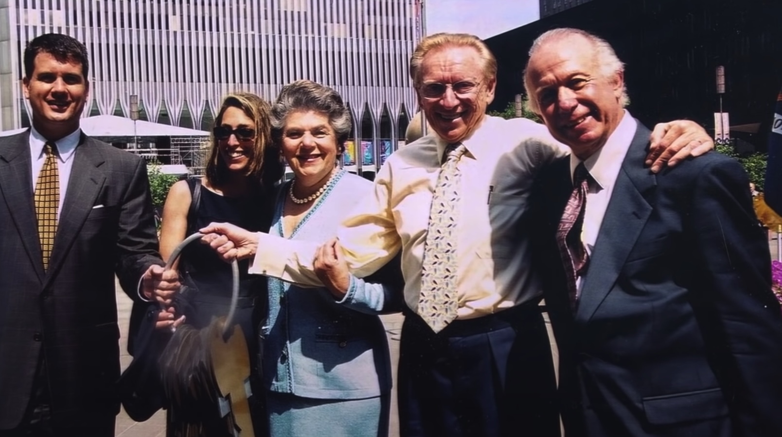
Above: Larry Silverstein with the keys to the World Trade Center. Image courtesy of Silverstein Properties Inc.
Then, after 9/11, the Lower Manhattan Development Corporation - or LMDC - was formed to distribute more than USD $10BN in federal funds to rebuild Downtown Manhattan.
From the outset there was no true, single client for the site and no power structure for decision-making.
There were other forces too, like then New York City Mayor Mike Bloomberg who took office in January 2002 and state Governor George Pataki.
Pataki, Silverstein and the Port Authority wanted to rebuild all of the office space that had been destroyed but found themselves struggling to convince the public who felt that what should be a memorial site was being overly commercialised.
Enter the 2002 design competition: where nine architecture firms were invited to submit master-plan ideas in an attempt to get people excited about a site that respected past events, but also included real estate.
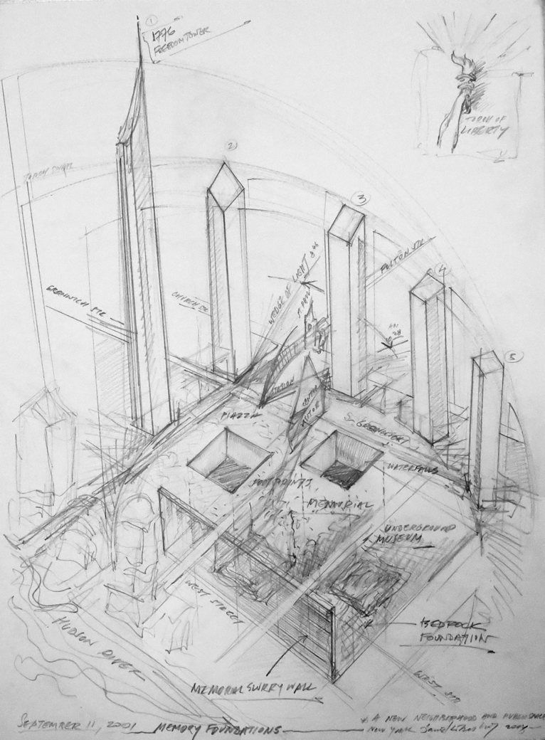
Above: Daniel Libeskind's original master-plan for the site. Image courtesy of Studio Libeskind.
Studio Libeskind won this competition with a plan to push the site beyond its commercial purpose.
In his own words, Daniel Libeskind set out to “create a space for people, not just corporations”, proposing skyscrapers that would bow towards the site of the original World Trade Center Towers, where a new memorial would be built.
Crowning everything would be New York’s new tallest building. A structure that would rise to a symbolic height of 1,776 feet - nodding to the year of American independence. The public fell in love with the idea and Pataki dubbed it the “Freedom Tower”.
But that’s where things got even more complicated.
In the competition, city officials had asked architects to design buildings in an effort to help communicate and sell their ideas.
But that’s all it was. It was never intended for Libeskind to design and build the Freedom Tower, he was overseeing the wider masterplan.
Larry Silverstein ignored Libeskind’s tower proposal - as he was technically entitled to - and appointed David Childs of Skidmore, Owings and Merrill to design a building for that part of the site.
What followed was pretty tense all-round.
After some negotiating, Libeskind let Childs take over the role of architect of the Freedom Tower and agreed to “meaningfully collaborate”.
Libeskind sent architects into Childs’ office to watch what was happening, Childs developed a design with more floor space and a shorter spire, Libeskind asked Pataki to override this, eventually the two architects both compromised and merged their designs and Libeskind later sued Silverstein for unpaid fees relating to his early work on the project.
Finally, in 2003, a new tower was unveiled to the public.
Many in the architecture world were relieved it didn’t look like a camel - that is, a horse designed by committee - but others criticised several unresolved aspects of the design, and all the while the awkward project continued.
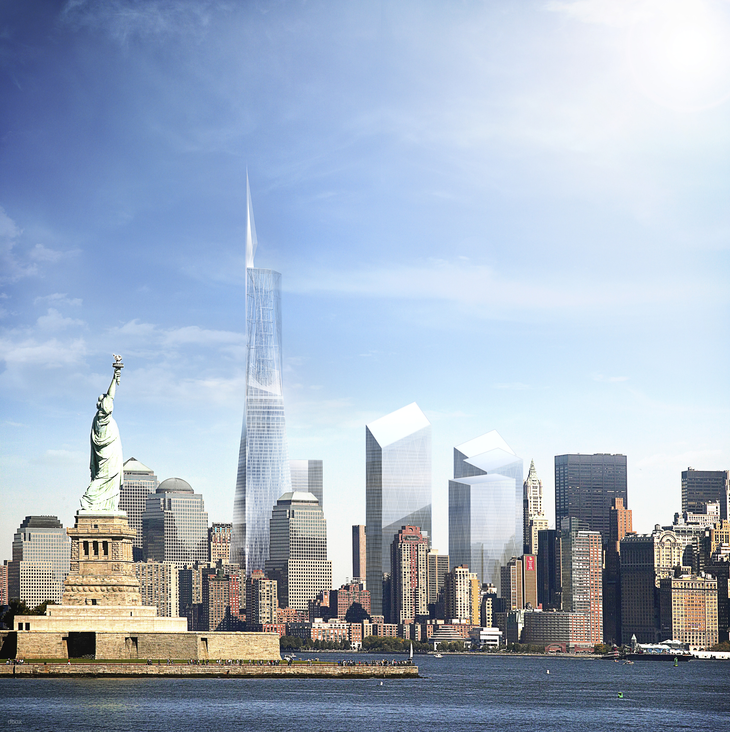
Above: The 2003 iteration of the tower. Image courtesy of DBOX and Skidmore Owings and Merrill.
Then in May 2005, sensing the public’s unease, another New York force got involved.
Donald Trump sponsored a plan to get the original towers rebuilt but in a slightly taller, stronger and “better” way.
The idea was never an officially recognised design - more a protest campaign that gave a voice to those who didn’t like the plans on the table and it never went anywhere.
In June 2005, the tower was redesigned again, this time in response to the New York Police Department requesting changes so that it could be “the safest building in the world”.
This new design came from Childs and Skidmore Owings and Merrill alone, shedding many of the bolder and more ambitious elements seen in earlier concepts. The building instead evolved into a somewhat pedestrian and inoffensive skyscraper - the kind you’d take home to meet your mum.
It had no windows for the first 50 metres and its concrete base was clad in a “shatter-proof” glass, to an extent disconnecting the tower from the very site it was there to anchor.
Afraid they would scare off potential tenants with a name as audacious as Freedom Tower, the new rebranded, redesigned One World Trade Center finally broke ground in 2006 and began to rise above the city.
Around the building’s huge concrete core, a beefed-up steel frame was constructed - designed to redistribute loads if columns were to fail.
Unfortunately, the compromises didn’t stop at the design stage. During construction, the tower’s spire wasn’t properly finished.
In 2011, due to cost, maintenance and safety issues, it was stripped back from a triangular clad architectural feature to an exposed steel antenna, but it still rose to 1,776 feet - achieving the height part of Libeskind’s master-plan while compromising on the form it took to get there.
Finally, in 2014 - 13 years on from 9/11 - the USD $3.8BN skyscraper completed, rising 104-storeys above Manhattan to become the tallest building in the Western Hemisphere.
The original World Trade Center Towers were also marred in controversy. Their construction was met with lawsuits and they were criticised as being unimaginative when they first completed in 1970. One reviewer said they looked like the boxes that the Empire State and Chrysler Buildings were delivered in.
And yet, over time, they become synonymous with New York; an awe-inspiring architectural ode to the city’s capitalist ambitions. They became American icons.
David Childs described how he wanted to capture this simplicity in his design for the new World Trade Center. In terms of aesthetics many agree that he largely accomplishes this. His design is geometrically pleasing and uncomplicated - and it catches the light in some spectacular ways.
But it’s also criticised for being too generic. It bears a striking similarity to the New York Stock Exchange Tower proposed in 1996 and the Northeast Asia Trade Tower in South Korea.
One architect even alleged that Skidmore, Owings and Merrill had copied the tower’s design from his 1999 student thesis project.
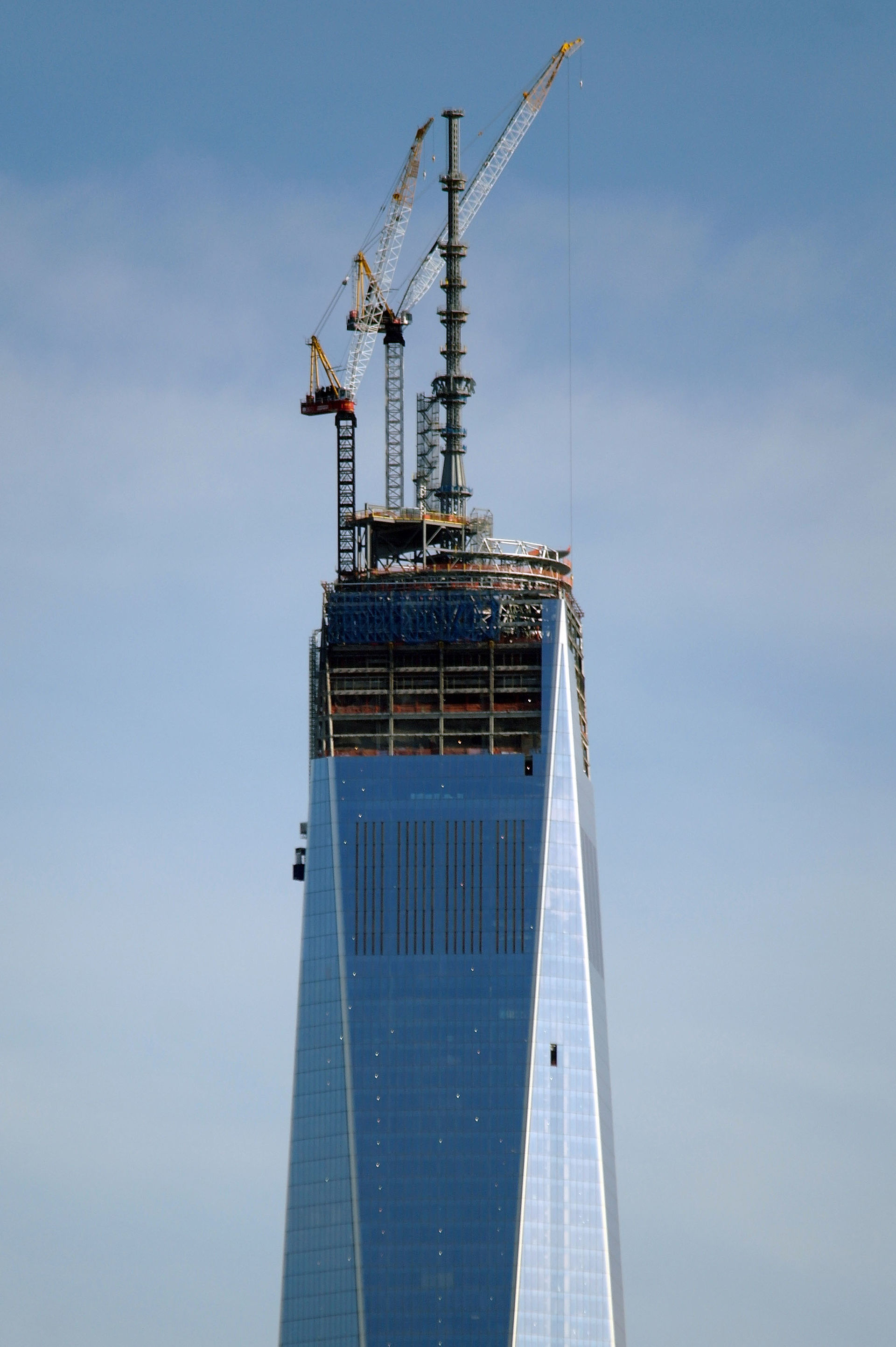
Above: The tower has been criticised for its generic design. Image courtesy of Alec Perkins.
In reality, the project always presented a pretty impossible task regardless of who its architect or decision-makers were.
Where some wanted a memorial, others wanted a commercial hub. Where some wanted a strong building, others wanted an elegant one. In the end everyone got a little bit of what they wanted and the overall result felt exactly like that.
Writing just before the building’s opening in 2014 the Chicago Tribune’s then-architecture critic Blair Kamin said that the tower signalled the rebirth of the city while also feeling set apart from it - “it’s standoffishness a byproduct of ground zero’s underlying conflict between remembrance and renewal.”
Some have argued that a longer passage of time before rebuilding would have allowed for the construction of a more architecturally-daring skyscraper.
But New York’s skyline was broken, and it needed to be fixed.
Our buildings are all a product of their context and One World Trade Center is what emerged from an horrific event and the emotive, power-confused determination to remember and rebuild that ensued afterwards. In that sense it’s the only building that could have risen from the site and it’s now part of the fabric of New York.
Just as the original towers became synonymous with the city overtime, the new skyscraper is already held in greater affection today than it was when it opened, less than seven years ago - it’s appearance across pop culture normalising its final form.
Time will be this building’s fairest critic and the next generation may conclude that the trade-offs and compromises of One World Trade Center ultimately speak more powerfully to the challenges of this site, than anything an architect could plan.
Narrated by Fred Mills. Additional footage and images courtesy of The Dronalist, National Oceanic and Atmospheric Administration/ CC BY-SA 2.0, Silverstein Properties Inc, Bundeswehr-Fotos, Studio Libeskind, Alec Perkins/ CC BY-SA 2.0, Vlad Lazarenko/ CC BY-SA 2.0, Gerd Eichmann/ CC BY-SA 2.0, Beija/ CC BY-SA 2.0, Carol M. Highsmith/ CC BY-SA 2.0, King of Hearts/ CC BY-SA 2.0, Anthony Quintano/ CC BY-SA 2.0, Marc Nozell/ CC BY-SA 2.0, DBOX/ Skidmore Owings and Merrill/Millar.
We welcome you sharing our content to inspire others, but please be nice and play by our rules.
